Snus- och Tändsticksmuseum
– Igniting a Hidden Gem
Stockholm, Sweden
Positioning
Brand Strategy
Brand Identity
Signage
Interior Design
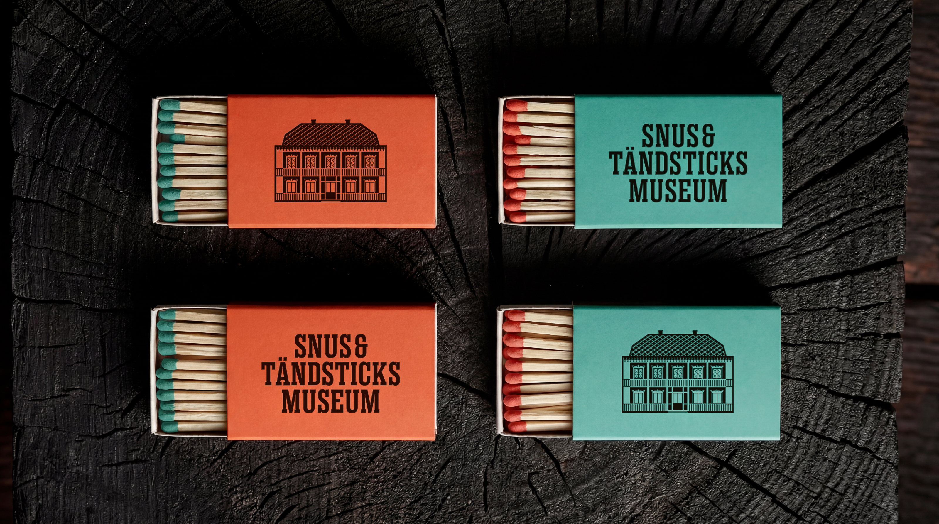
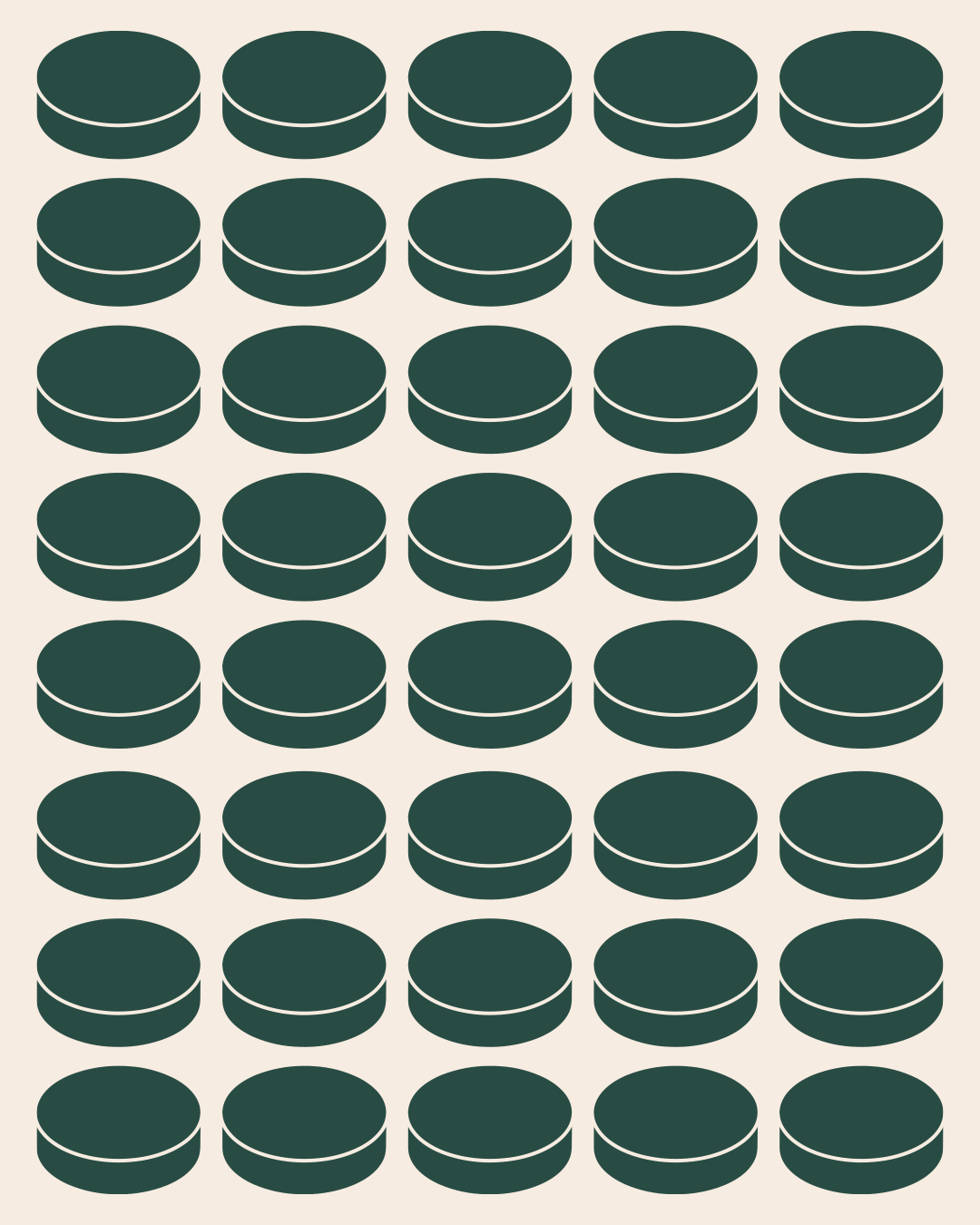
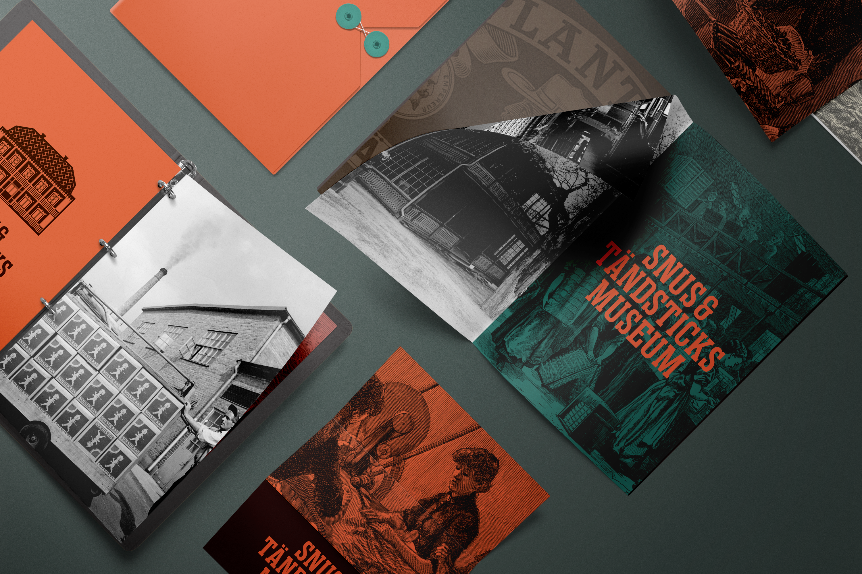
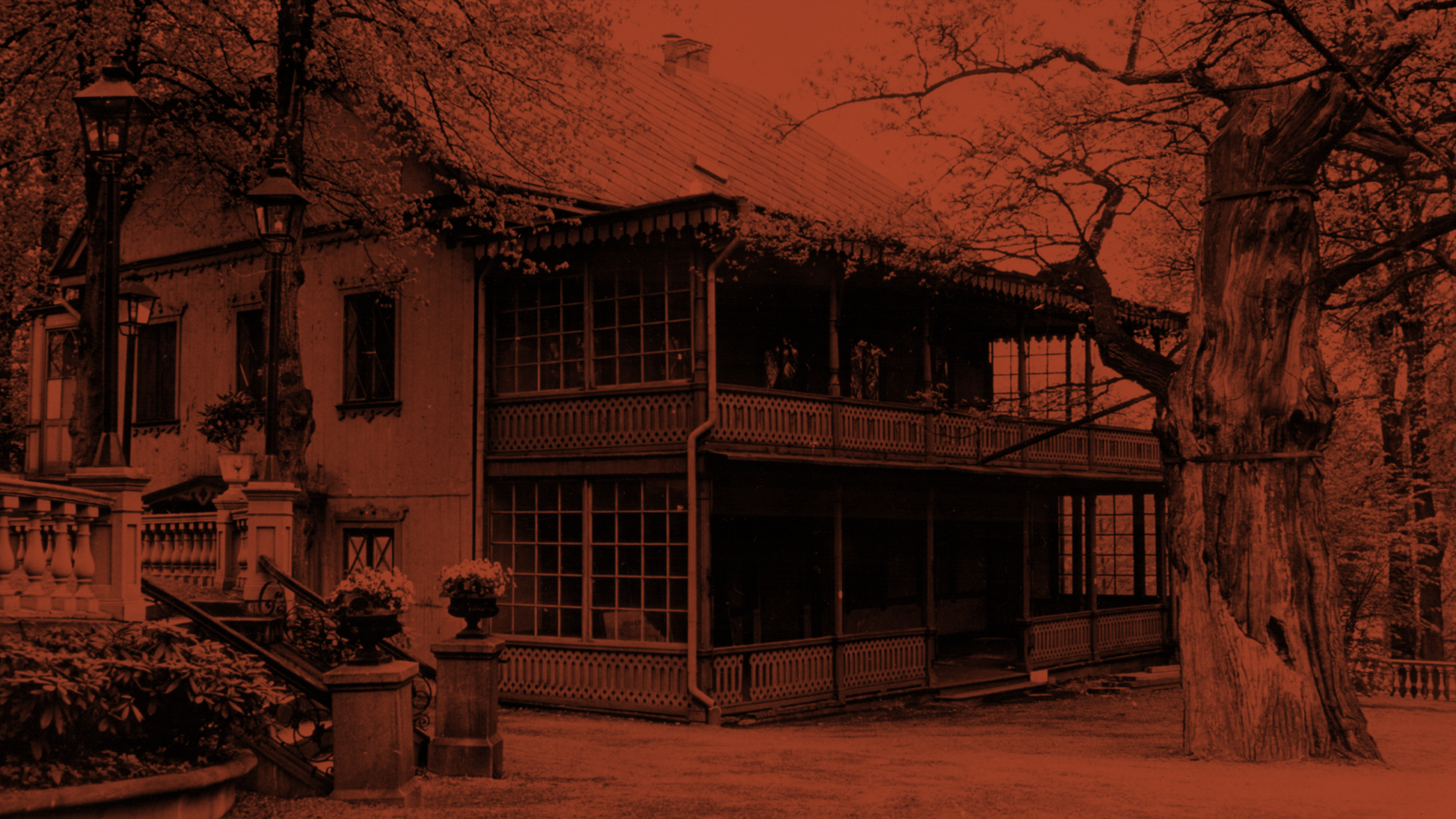
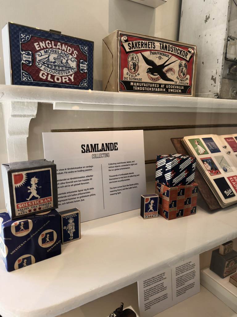
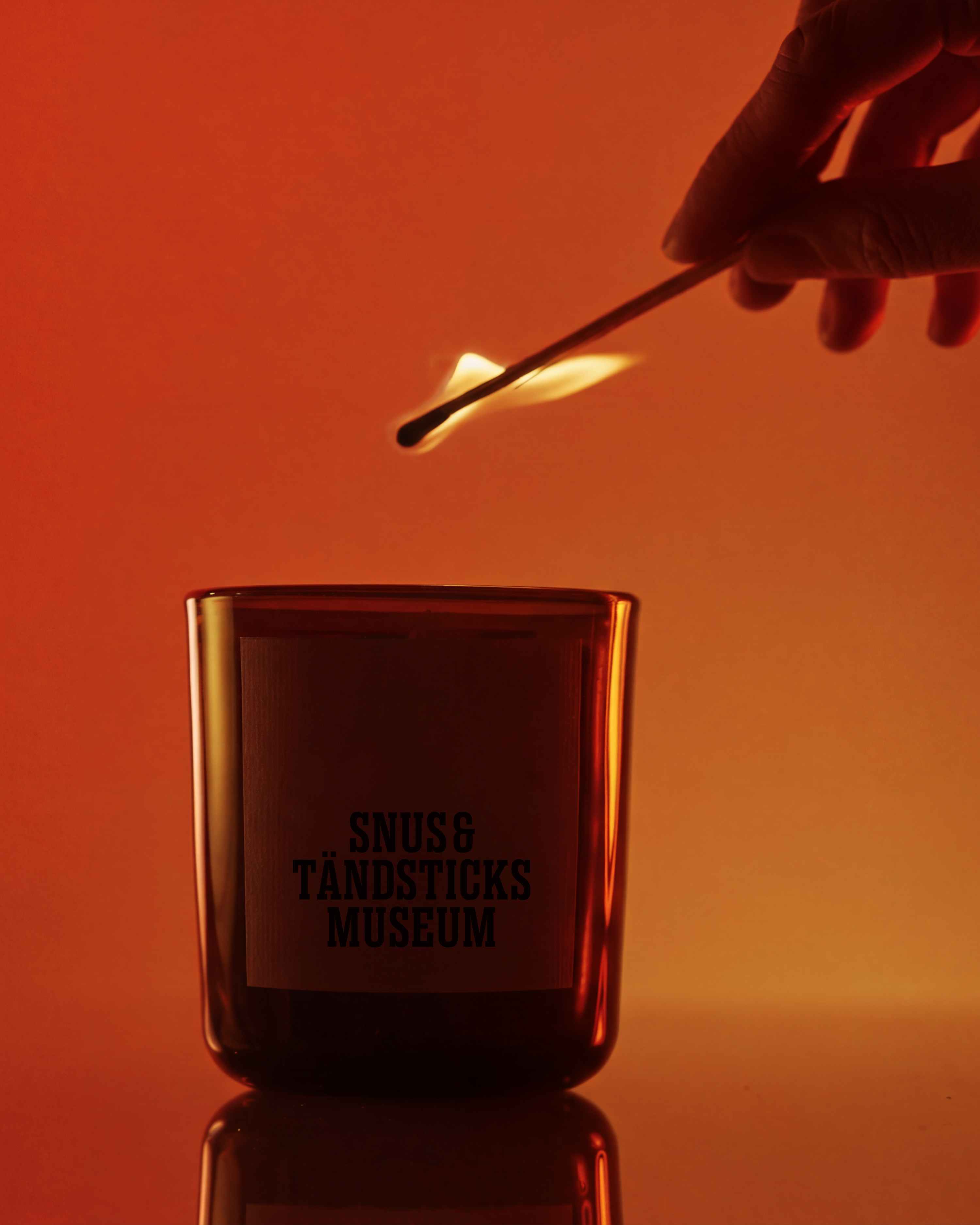
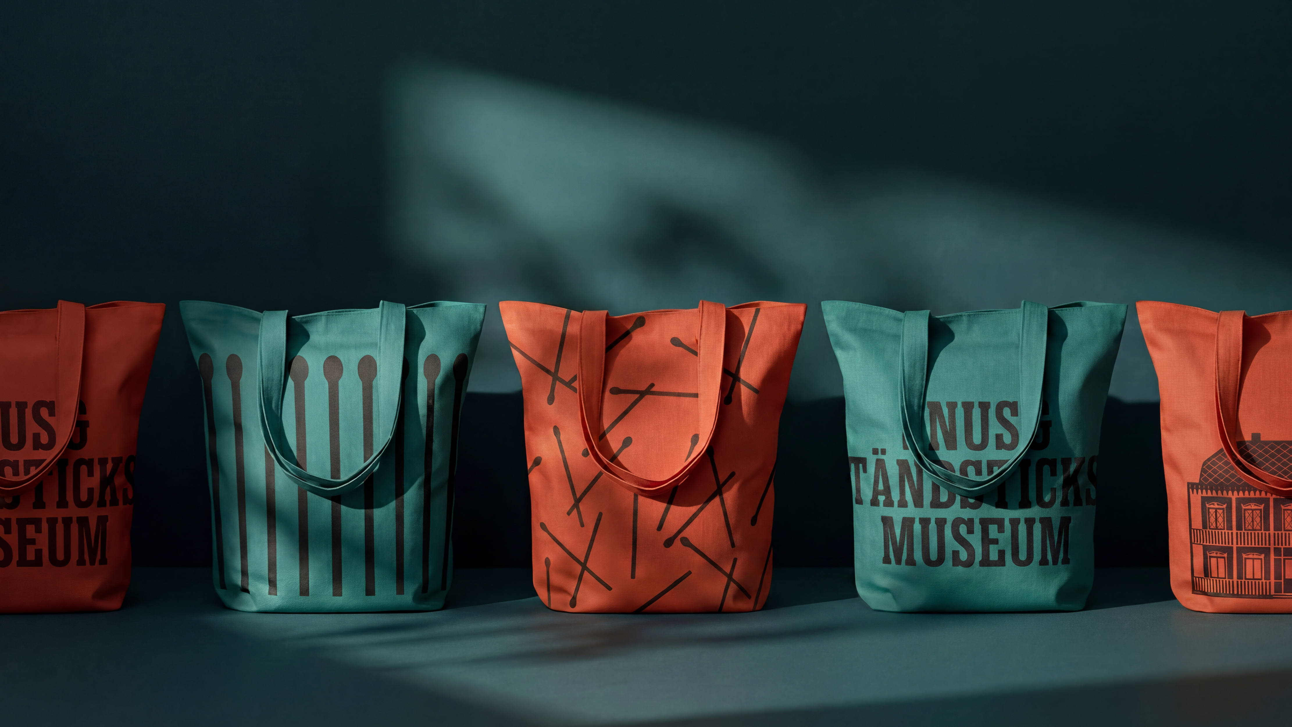
Founded in 1938 as a personnel museum for the employees of Svenska Tobaksmonopolet, Snus- och Tändsticksmuseum has long stood as a quiet custodian of Sweden's industrial and cultural memory, holding fast to the stories a nation might otherwise forget. Housed within "Gubbhyllan", a Swiss-style building raised in 1816 and later relocated to the grounds of Skansen, the museum carries nearly a century of narratives about snus, tobacco, and matches: three objects that once played an important part of a nation's craft and commerce. Yet its position directly at Skansen's main entrance, a busy thoroughfare crowded with information, visitors, directions, and signage, meant it needed a clearer sense of definition and a bolder voice to be heard above the noise. In response, the renewed identity places the very objects the museum celebrates, matches and snus tins, at its center, giving them a prominent role as expressive, playful graphics that root the visual language in the material world the museum exists to honor. Guided by six values, engaging, proud, credible, deepening, original, and welcoming, this transformation marks a considered evolution rather than a departure from the past, honoring tradition while embracing a contemporary voice.
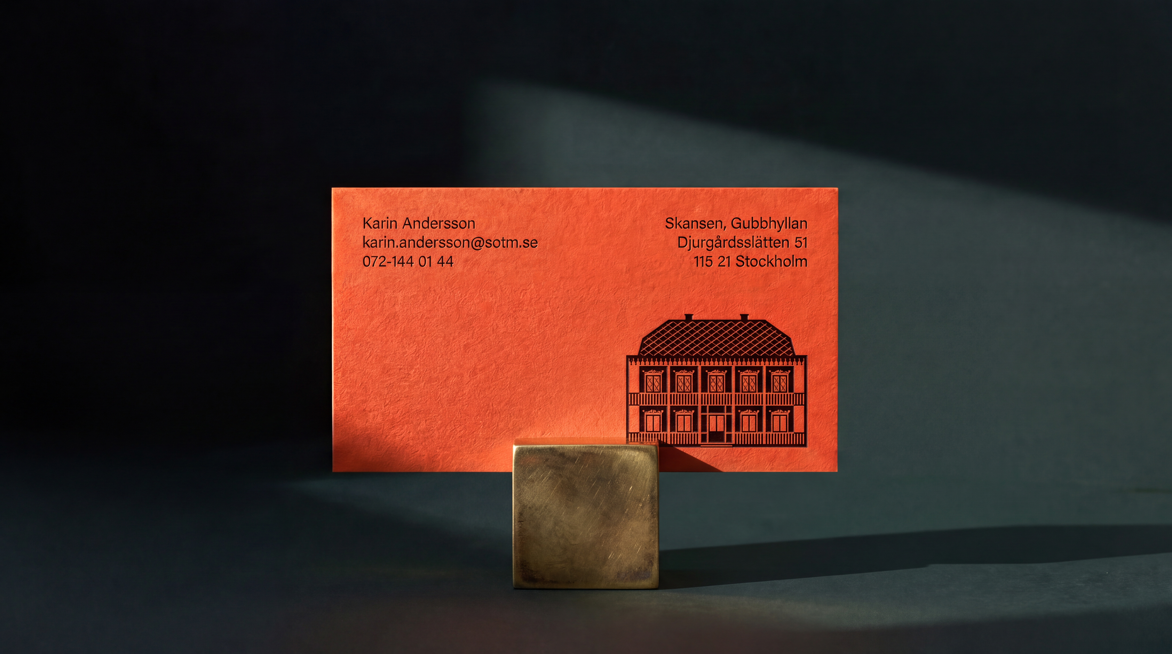
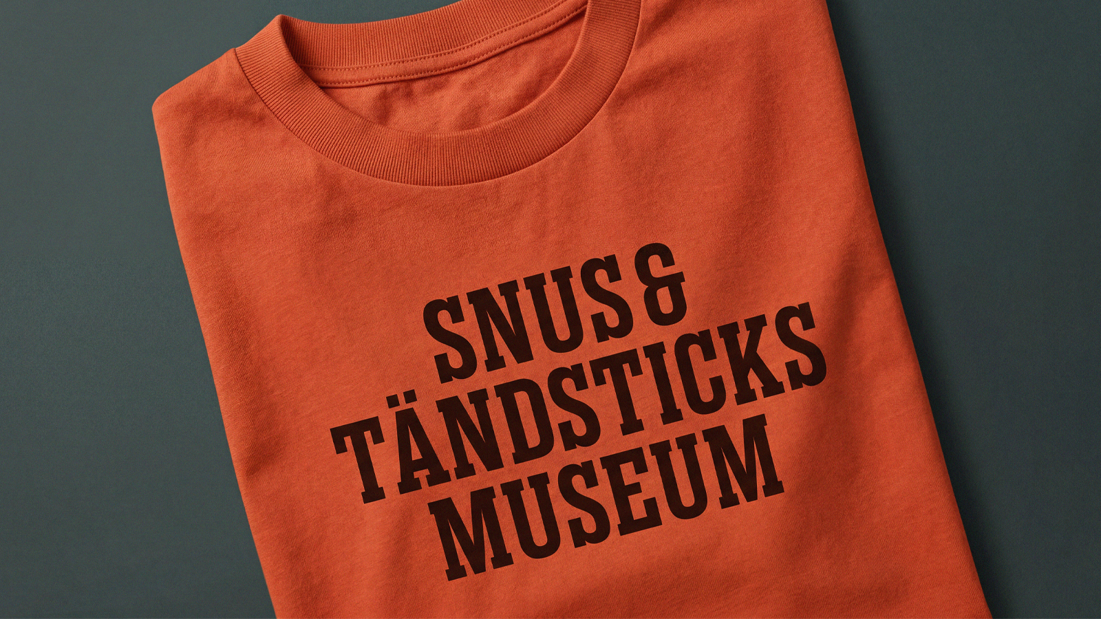
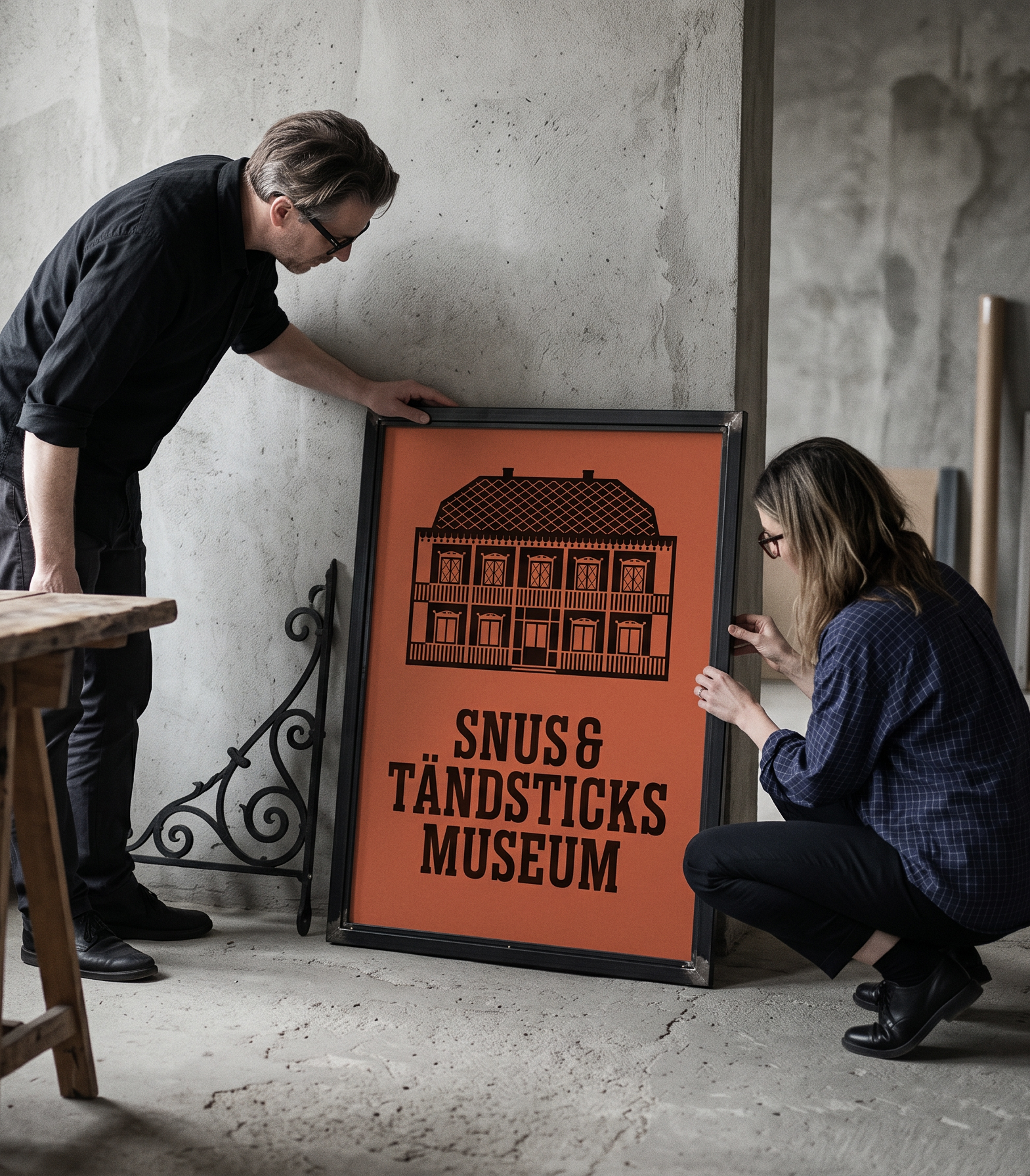
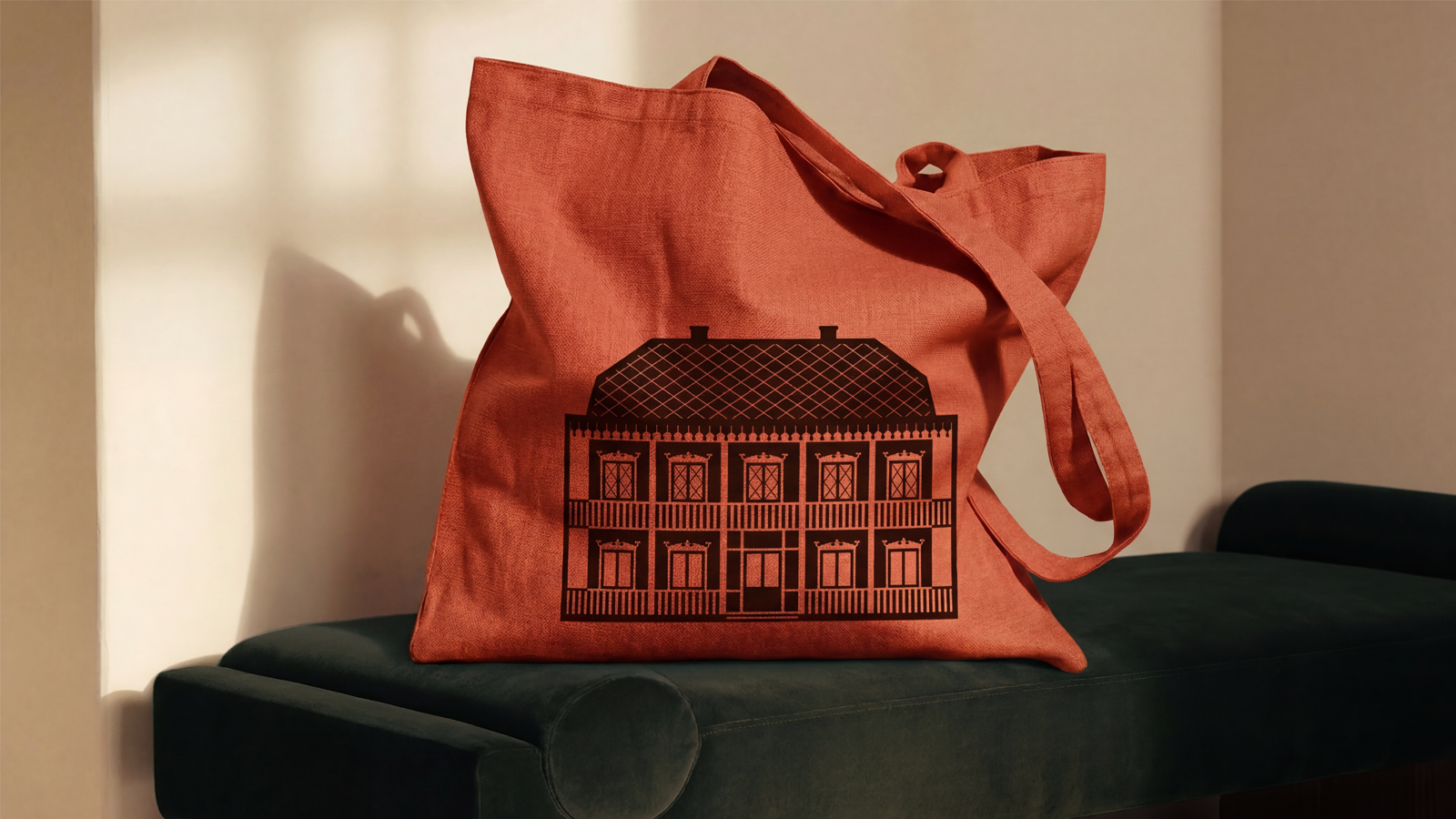
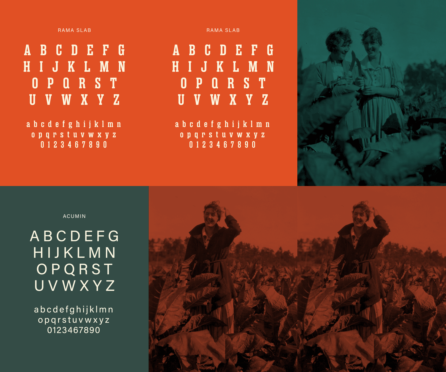
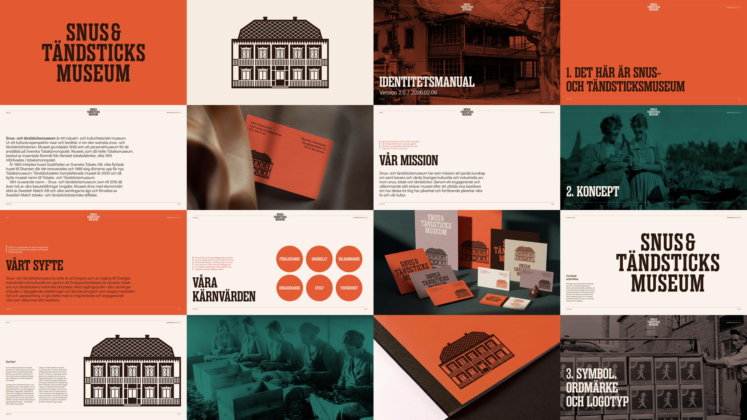
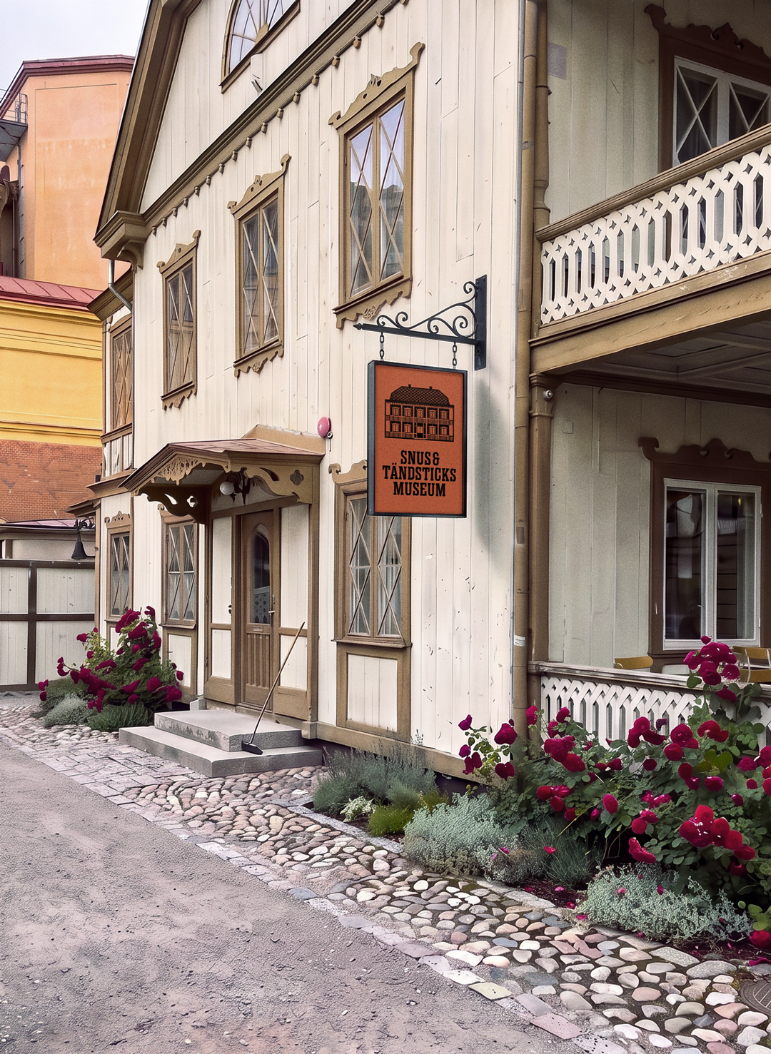
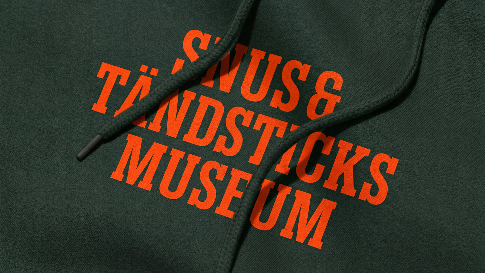
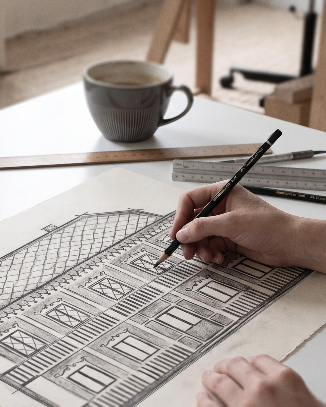
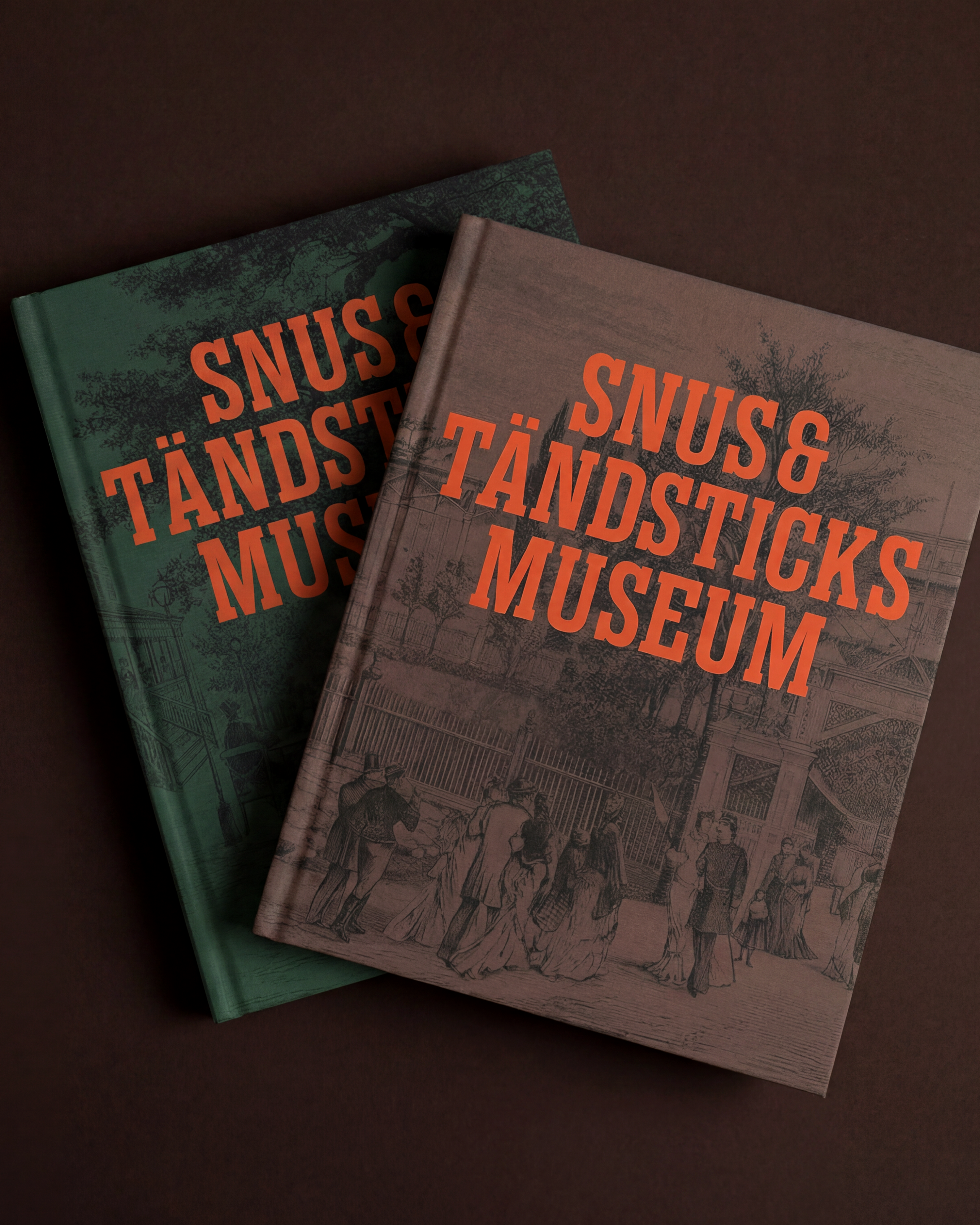
The revitalized identity finds its anchor in the building "Gubbhyllan" itself, reimagined as a stylized architectural landmark and the museum's clear, self-evident face to the world. The building's Swiss-style fretwork, mansard roof, and characteristic veranda are distilled into a brand mark rooted in place and history, a visual signal that speaks before a single word is read. Supporting this symbol, the typography moves with quiet assurance, pairing the robust slab serifs of Rama Slab, inspired by old tobacco, snus and match artwork and the signage of "Allmänna konst- och industriutställningen 1897", with the clean, modern lines of Acumin for effortless readability. These two typefaces echo the stability and craftsmanship of Swedish industry while remaining wholly accessible to a contemporary eye. Color deepens the story further, harvested directly from the museum's own materials: the vivid red-orange of a match ignition tip, fire, and old packaging; the lush chlorophyll green of tobacco leaves; the quiet gray of ash; and the warm, natural tones of wet snus and aged wood. Woven together, these elements form a language that is at once decorative and documentary, celebrating industrial heritage while bold enough to meet the expectations of a modern audience.
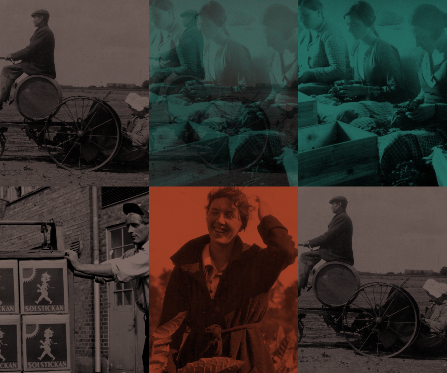
The new brand concept, "Bland stickor och blad," meaning Amongst sticks and leaves, reaches past the objects to the lives behind them: the workers who shaped the industry, the tobacco fields that once defined whole landscapes, the rise and fall of a family-owned enterprise, and the small Swedish invention, the safety match, that quietly changed the world. Rather than framing Snus- och Tändsticksmuseum as a narrow specialist collection, this idea repositions it as a living meeting place for knowledge, culture, and experience, carving out a distinct and confident niche within the wider cultural landscape. In doing so, the museum has not only refreshed its visual identity but redefined its role, emerging as a vibrant and credible destination for visitors who value both heritage and innovation. It stands today as an inviting entry point to a long-overlooked chapter of Sweden's industrial story, told with authority, warmth, and the clarity its history has always deserved.